Ignoring accessibility? Introducing our Colour Contrast check
Andrew Waite • February 28, 2023
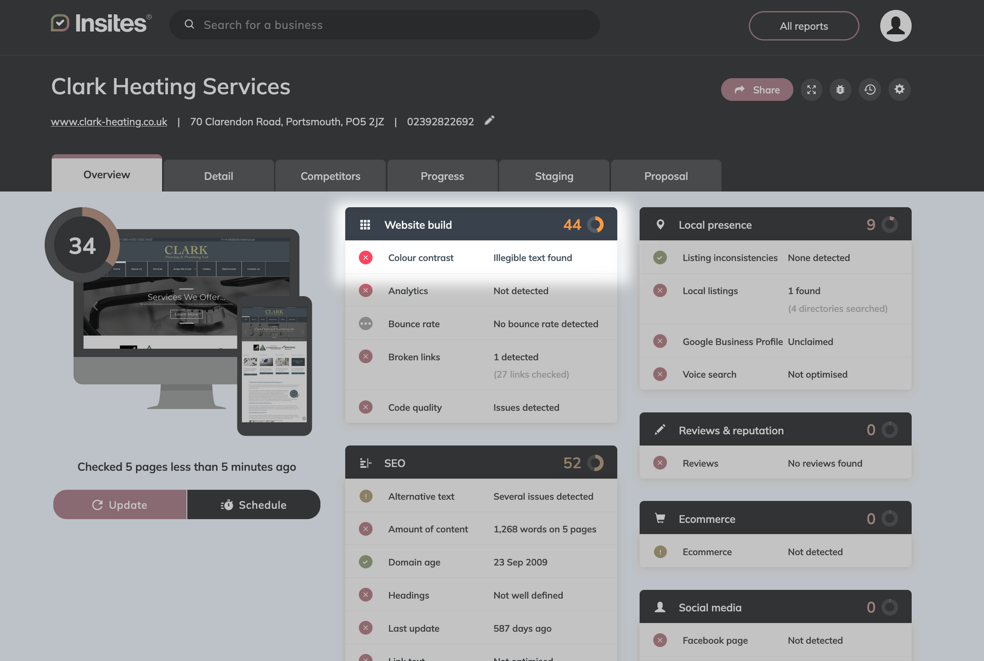
Have you ever visited a website and found white text on top of a mostly white background image? As a sighted person with good vision, it’s a terrible user experience . But for those with impaired vision, poor colour contrast can make websites completely inaccessible . Take a look at this example of hard to read text from a plumber’s website:
This isn’t a small issue – there are over 2 million people in the UK living with sight loss. Why would you alienate such a huge potential audience from finding out about your business and buying your products?
Moreover, how can you as an agency convince your SMB clients that accessibility matters, and how do you deliver accessible websites at scale? Well, to make this easier for you and your clients, Insites is excited to add colour contrast checking to our comprehensive digital marketing audits.
Getting into the details
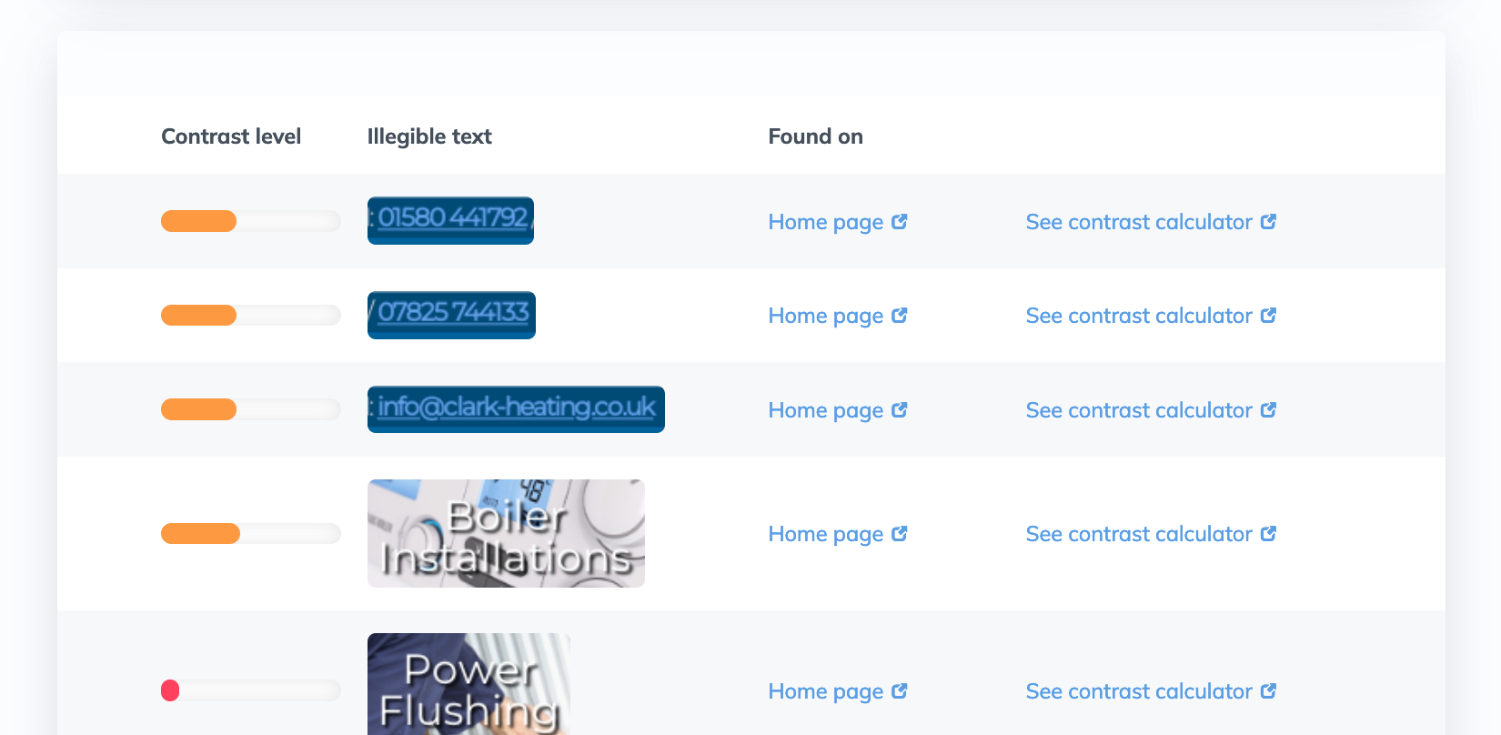
Once you click through to the detailed breakdown, we explain in simple terms to your team & your clients exactly what the issue is and why it matters.
Better than that, all the colour contrast issues we’ve found on a website are shown in the audit with a visual screenshot of how it looked when we tested it. We even include a handy link to a colour contrast tool so production teams can quickly pick a more suitable colour.
What makes Insites’ colour contrast check different?
Insites has put a huge amount of of hard work into making sure the new colour contrast checker is comprehensive , accurate and easy to understand for you and your clients.
Every page checked automatically
We don’t just scan one page at a time – Insites can check your whole site in seconds. You get an easy breakdown of ALL the colour contrast issues in one place .
We can check text on top of background images and gradients
Most automated colour contrast checking tools (in fact, all the ones we’re aware of) can only check text colour against a solid background colour (e.g. white text on a blue background). If you put text on top of a gradient or a background image, other tools either don’t bother checking, or tell you to check the colour contrast manually. Insites has developed a proprietary new technique that allows us to accurately assess colour contrast of text, no matter what the background is .
Our check highlights real errors, no false positives
We’re using the latest APCA-W3 algorithm that’s part of the draft WCAG 3.0 spec. What does that mean in layman’s terms? Well, the current accessibility guidelines ( WCAG 2.1 ) use a colour contrast algorithm that’s been widely debunked as not matching human perception. The new APCA-W3 algorithm allows us to assess colour contrast in a way that matches what real users see much more closely and flag the real issues that matter to website visitors.
Sounds good, how do I enable it?
This check is available to all our customers now as part of an open beta. It can be enabled in your Insites account from the test settings menu. If you have any feedback about this check we’d love to hear it – contact your Customer Success Manager or send us a message.
It’s important to note that colour contrast is just one small but important part of accessibility. We’re going to be working hard to provide more easy to understand and actionable accessibility checks in the future. Watch this space!


